

I don't set much store by these things -- if I like a color I'll use it regardless of what's trending -- but when Michael pointed the Pantone report out to me the other day, I was excited, since it looked exactly like the red I chose for my men's chore jacket. I was calling the color of my jacket cranberry. I went to the Mood site where it can be purchased online, however, and they refer to it as tomato.
There is a pantone color called tomato purée -- 18-1661 -- which does look more like my red than the aforementioned aurora. It's very confusing and also hard to distinguish one from another on a computer browser, plus cameras will photograph the same color differently depending on things like white balance (I think). Below, my jacket fabric.

The jacket is now finished. Yesterday, I picked my buttons at C&C Buttons on 38th Street. I decided to go for a monochromatic effect. My buttons are red, though exactly which red, I couldn't tell you.

On the same block as the button shop is Jonathan Embroidery. I like the jacket so much that I decided to splurge and have Jonathan make my buttonholes. I could certainly have done this myself, but there's something about a professionally made buttonhole that raises the garment up a notch for me. Each buttonhole costs $1, and for no extra charge they'll feed something akin to buttonhole twist into the stitch, creating a raised buttonhole effect. I'm very happy with the result. (They cut open the buttonholes as well.)
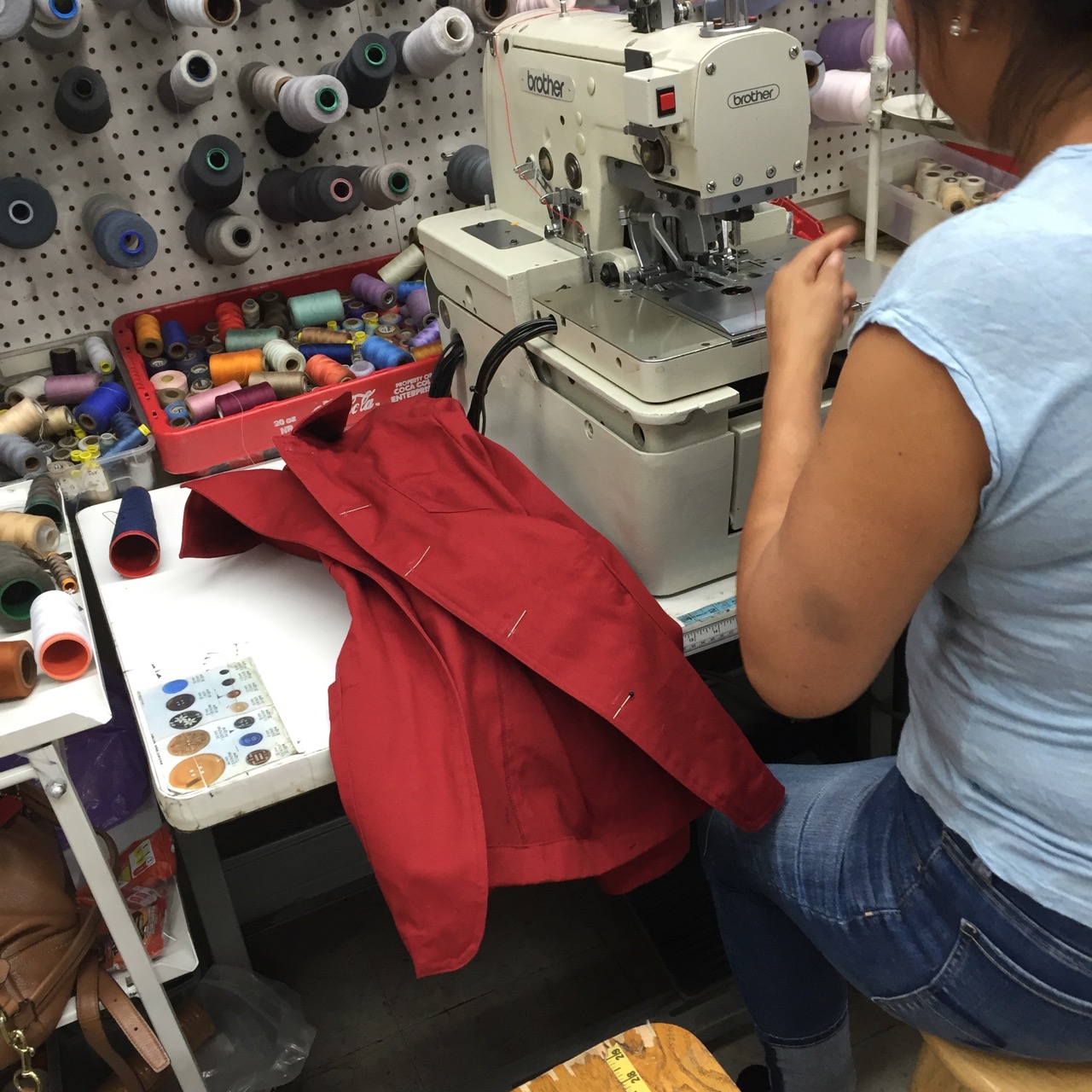

You can see a very short video of my buttonholes being made here. It's amazing to me how fast those machines go and how quickly the women operating them work.
In other news, I received a couple of new men's patterns, purchased as a pair on Etsy: one for a blazer and one for a "popover" shirt. I suspect the shirt will be one of my next projects. I love them both.

And that's it. Tomorrow's our photo shoot; the jacket will be revealed on Monday. Cranberry, tomato, or aurora, it's definitely very, very RED!
Have a great day, everybody!
 |
| Sleeves didn't have enough extra length for a deep hem, so I added a bias facing. |


The button holes do indeed raise the bar.
ReplyDeleteThose vintage patterns are real finds. Can NOT wait to see you model them (or Michael for that matter).
Loving this - can't wait for th reveal. Can you do a blog entry on making a bias facing? That looks interesting - and I love how you teach about the techniques you use.
ReplyDeleteNice, Peter! I think cranberry is a bit bluer, and tomato has a slightly orange cast. I'll call your jacket a Porsche red. Love it!
ReplyDeleteIt's interesting that (on my computer) your jacket color is slightly different in the various photographs in this post. Some look more fire engine red, another leans toward a wine-colored cranberry red, another looks tomato (but not Beefsteak -- more of a really ripe Roma). Just yesterday at a thrift store I found a poplin in a cranberry that looked slightly bluer than your red and thinking of your project, went ahead and bought it. Now that it's home, it looks really, really wine-colored and I'm not so pleased with it. So much for fluorescent lighting. :/
ReplyDeleteI just purchased a Brother buttonhole machine that looks to be a previous generation of the one making your buttonholes. That one does a great job. AND, I also have Butterick 2125 so I'm very interested to see what you decide to make with it and the other pattern too.
I do hope a) that you're all ok after the explosion nearby that I just read about and b) that you wash your fabric carefully... red has a horrible tendency to run and you end up with a pink tinge on everything else in the washing load.
ReplyDeleteLooking forward to seeing the jacket photos!
All is well. Thanks, Jen!
DeleteJen in Oz, A dye detergent like Synthrapol or Restyne (sp?) will remove the excess and prevent running. It's available at Dharmatrading and other places. I just noticed that DT also has a non-toxic alternative.
DeleteWord of warning if you do use Synthrapol, while non-toxic and relatively low-scent, the fumes gave me terrible headaches. At the time I was living out of one room and had a leaky bottle so it inundated my space. As long as the bottles are sealed well and stored away you should be fine. Otherwise, it does work great for removing the excess dye. I used it all the time when I was silk painting.
DeleteI'm excited to see this. I love red in the fall and winter. Oh! And I say tomahto. 🍅🍅🍅
ReplyDeleteThank you for the interesting video. I'm just wondering,since I couldn't see it, how you marked the buttonhole for the embroiderer. Thread marked or pencil? And mark the bottom or the top? I agree totally that buttonholes done on an industrial machine raises the work a notch. The last time I got buttonholes done professionally was when I made a white silk shirt with some lovely antique thread buttons. Silk from Mood, buttons from Chelsea flea market; both discovered through your blog. Thanks!!
ReplyDeleteOops, just looked again, this time at the picture not the video- looks like you chalk mark and the button holes here are horizontal. Still interested to know, if it were a shirt with vertical buttonholes, would you mark the top or the bottom?
ReplyDeleteIn my experience, you need to make the spacing of the buttonholes clear. If you show them the button, they'll know the size of the buttonhole needed. With a vertical buttonhole, I'd probably mark the top -- not sure why though...
DeleteHere's the difference. Tomato is a yellow-orange based red, cranberry is a blue based red. Depending on the picture, your fabric sometimes looks blue based, sometimes not.
ReplyDeleteSo. Do you have a warm or a cool red fabric? That'll be whether it's tomato or cranberry!
-- Tegan
$1 buttonholes? No question here. And I would be making a lot more clothing with buttonholes!
ReplyDeleteTracker has it right. There are either blue reds or orange reds and sometimes something called true red. I can wear the orange red successfully, but the blue reds make me look pale and washed out. It's a lot about your skin tone.
ReplyDeleteI look forward to seeing the finished jacket. Those buttons are just perfect with the red fabric...beautiful!
ReplyDeleteIt's hard to say. Cranberry's more blue based and darker in tone. In some photos the fabric looks somewhere between a tomato and a cherry red.
ReplyDeleteI went to this site to key in the Pantone colors and found it too orange for Cranberry. My Pantone color guide confirms a "Tomato" red.
ReplyDeletePeter, to mitigate the way white balance changes hue of fabrics, I'll often drape (or ask a friend to drape) fabric across a sheet of typing paper and include a little bit of both in the photo. That's often enough to help a camera pick a good white balance; but if it doesn't, I can then use a photo-editing tool to correct the white balance after the fact using the typing paper as a reference for true white. (The typing paper could even be cropped out of the white-balanced photo.) It's not perfect but it usually trues up colors considerably from what the camera does on its own.
ReplyDeleteMy older camera, may it rest in peace, would let me set the white balance by focusing on a sheet of typing paper, then keep that same white-balance setting (until manually changed) while shooting my picture under the same lighting conditions. Incredibly handy -- very accurate color rendition without having to touch up in edit.
Thanks, Keith. I'm going to have to experiment with that.
DeleteI can’t wait to see the final garment! Those buttonholes are worth the money. Wish I had that service near me.
ReplyDeleteDetermining color online drives me crazy, even if the white balance is supposed to be the same in all photos. Different monitors give me different results, even when they are all “calibrated.” My home computer seems to have more of a bluish tone than the one at work.
Love the jacket! On this monitor, I'd call it tomato clay.
ReplyDelete