

Friends, I generally avoid polka dots.
I find them hard to look at, especially if they're evenly spaced. But even if they aren't (George Clooney, up top), they can overwhelm.
I've sewn only a few polka dotted projects with mixed results. I liked this polka dotted shirt I made a number of years ago (below). Thankfully the dots were teeny, which helped, but it still photographs funny.

Remember my polka dot man skirt? (Not a miss, perhaps, but close.)
This week I decided to give polka dots another try. I found a silky cotton polka dot print at Mood in a palette I loved -- very Fifties retro, don't you think? It reminds me of formica countertops.


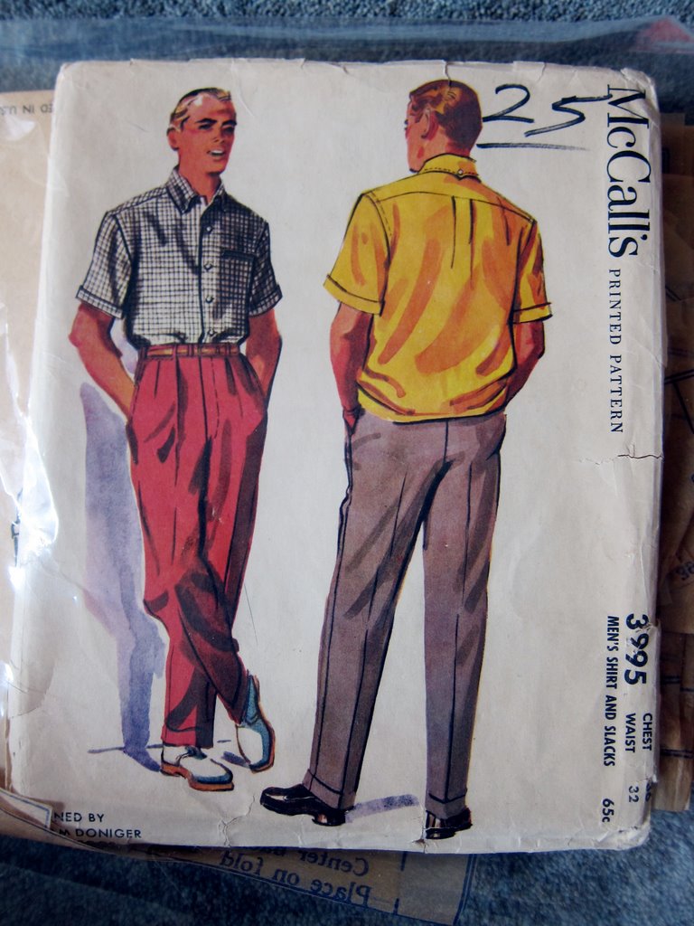
The uneven dots and the mix of colors make it easier on the eyes, imo. I thought it would make a great short-sleeve convertible-collar shirt for an upcoming warm-weather vacation. I used a favorite pattern, McCall's 3995, which dates from the late Fifties.
Here are some progress shots: it's almost finished.
 |
| The back has a center pleat. |

Instead of interfacing my shirt facings the usual way, I used a technique called "facing the facings." I stitched my interfacing to the edge of my facings, right sides together, folded the interfacing over the edge and then fused it to my facing with my iron, leaving roughly 1/8" of fabric at the inside edge. The result is a nice clean finish that doesn't require serging the edge or folding the raw edge under and stitching, which can look bulky.

 |
| Here's what it looks like with the facing folded into place. |
I made my buttonholes with my vintage Singer buttonholer (model 121795 -- easy to find on eBay). Here's a short video of the process. Naturally, I reinforce my buttonholes with Fray Check. Did you know Fray Check is actually liquid nylon?

Below, you can see me topstitching the cuffs of my sleeves. I've been making this shirt on my Singer 15-91, which I've been using for nearly all my sewing projects these days, along with my Bernina 930. Nothing wrong with my other machines, but these two have been operating flawlessly. The 15-91 is one of my earliest vintage straight stitcher acquisitions.

As soon as the shirt is finished, I'll show it to you -- hopefully this week.
In closing, are you a polka-dot person or do you generally avoid them (as I used to). Why are they so hard to look at?
Have a great day, everybody!

The "Polka Dot Polka" -- must be seen to be believed!


george clooney can make anything look good -- but i think i'd still give his suit a shot. and i am really liking your choice of fabric for your shirt, too -- i think it's going to look great!
ReplyDeleteYour shirt is looking good and I love your facing technique.
ReplyDeleteThanks for the great Polka-Dot Polka. And your shirt looks great, wish I could sew like that!
ReplyDeleteI like very much your palette choice. May be I would have prefer a black collar ? Not sure. Thanks to share the interfacing interesting method. One question : if no mistake, this technic needs to interface the whole front pieces or just the borders ?
ReplyDeleteThis is just to interface the facings, which fold back at the edges of the shirt fronts.
DeleteLove the shirt fabric. Will be a fun novelty shirt. Your work as always is inspiring
ReplyDeleteI really like your fabric choice for your shirt. I also want ti learn more about facing the interfacing. Interesting and I think it would be very useful.
ReplyDeleteDon't remember ever thinking about polka-dots before now. Your new shirt fabric is, however, interesting and attractive. The shirt will be lovely for Spring. You have imagination as well as skill.
ReplyDeleteI like your fabric, but for some reason, maybe because I don't see a lot of men wearing them in real life?, it's reading as blouse or dress fabric in my mind. I'll probably change my mind when I see the finished shirt. Thanks for the tip on the interfacing the facing technique.
ReplyDeleteI don't know when the last time I had polka dots in a garment. I'm fairly sure there are none in the garment fabric stash. However the quilting stash has a number of smaller polka dots.
I love a polka-dot fabric, but I don't seem to wear it often. Really like the silk/cotton polka-dot fabric you've picked up for your vacation shirt.
ReplyDeleteI really like the new shirt fabric. I generally like polka dots - but they are rather iffy for men's clothing.
ReplyDeleteThis shirt will look great with a pair of jeans, I think.
Oh, I like the retro-looking fabric! It immediately made me think of a man's sports/vacation shirt from the 50s.
ReplyDeleteI think the main problem with symmetric dots is: there's no place to rest the eye. Conversely, there's nothing to hold one's attention, either! In the last shot, my eye kept going to the tats for relief from the dots.
For a bit of fun: with the picture of you in the red shirt, if you scroll it up and down a bit, the strobing effect makes it look as though you're flexing. (That was mentioned in a link in one of your "Meet the Misses" blogs, too, butt about a different set of muscles.)
Yes! What you said about symmetric dots reminded me of what my college art instructor stressed from the first day of all of his classes. Good composition must have "movement" leading the eye to a "center of attention".
DeleteThe polka dots you're sewing are sophisticated and whimsical without skewing towards Minnie Mouse. Great color harmonies too!
ReplyDelete"How do you feel about polka dots?" I lurve them.
ReplyDeleteIf only could wear that shirt in front of the stage curtain of my grade school's multi-purpose room.
ReplyDelete\
Luv the pattern, and the facings tip.
For facing the facing, when you say sew the fusible to the facing RS together, the RS of the fusible is the non-glue side, yes?
ReplyDeleteThen you fold and fuse the interfacing's glue onto the WS of the facing and end up with something conceptually akin to a French seam, only the second stage uses fusing instead of a second line of stitching, for an even cleaner look?
That is correct, Keith!
DeleteSlick. :-)
DeleteHm, realizing I still don't quite have the whole picture. You face the facing, and fuse the whole facing, and sew the interfaced facing to the garment in the usual way?
DeleteIt's a fold-back facing, so you simply fold it back at the front extension on both front pieces.
DeleteLove polka dots! Especially white on black and vice versa!
ReplyDeletePolka dots are hard to look at because they are naturally an obvious diagonal print. When looking at them you see lines moving which (to the brain) is very loud. Various sized and grouped dots are not usually symmetrical and are easier on the eyes (and the brain.) It has the same properties as Tartan plaid. Very loud.
ReplyDeleteThat is the best explanation I've yet heard for why polka dot prints can be distractingly "loud".
DeleteI don't like polka dots because they make me think of the clothes I wore as a little girl, and I'm a grown-up now.
I know what you mean about polka dots. I put some larger scale polka dot knit in my cart, and out of my cart at Marcy Tilton and ultimately didn't buy it. I decided it was cool on some people but not me. this is definitely cool on you. I love the colors and yes, it does look a bit retro.
ReplyDeleteI have no problem with polka dots. Try red and white houndstooth. A good friend who recently past away had a jacket of red and white hounbdstooth. Whenever she wore that jacket I had to look past her to speak with her. My eyes would water if I looked at her directly.
ReplyDeleteNow I've seen it, I'm still having trouble believing it. That's some scary video. What were they high on, is the question that comes to mind!
ReplyDeleteYour shirt is fabulous. :-)
I normality agree- I don't like polka dots because they're hard to look at, but that print with the broken lines of dots is very attractive, & the colors are retrotastic!
ReplyDeleteI will only wear polka dots mixed with another pattern to break up that brain scrambling effect. Your shirt does the same thing because the colors are pretty much the same value.
ReplyDeleteDang the costumes in that video might be the worst ever. Especially the boys’. How they must have loathed those bow ties🤣
At first I thought how did he find the polka dot polka clip, then about 1/2 way through I began to think why would have anyone ever produced this? Very funny - a must watch!
ReplyDeleteI love Polka dots, I actually have a black shirt with small white polka dots which I wear with a white tie which has black polka dots, the dots are small on both however, before you all cringe! George Clooney in polka dots, mmmmmmmm yes please. Love the fabric that you chose for your new shirt, that would look good for a 50's shirtwaister with a full skirt.
ReplyDeleteThat pink shirt is amazingly made, the matching of the polka dots is perfectly matched, urk those tatoos on the model however......
ReplyDeletePeter, I love that fabric - more like bokeh background than polka dots.
ReplyDeleteThe tattoos are lovely! The pink shirt - not so much. I find the small white button dots jarring, and the colour is ghastly with bond white dots. The sleeves don't sit right either... Did everybody know that you can dye shirt buttons with the 'synthetic' dyes? like Rit dye more, and Jacquard i-dye poly? just boil them up for the time to achieve the colour depth. You gotta play with the amounts. better than buttons interfering with the patterns... on that pink monstrosity, some should be pink, and some should stay white.