

Before I get started, why does current fashion illustration make women look like Bratz dolls? I don't like it one bit.
Moving right along...
Friends, how much do you know about color forecasting? I don't know much, but you'd have to live on Mars not to have heard that Pantone's official Color of the Year for 2012 is Tangerine Tango, aka orange. (You can read more about it here.) I hate to sound grumpy -- I am still recovering from my weekend cold -- but I was "over" that color ten seconds after seeing it; to me it screams Guantanamo Bay prisoner jumpsuits.
Why should we care about a Color of the Year? Is there a food of the year we eat to the exclusion of others? (2012 -- Year of the Pickle!) The beauty of sewing our own clothes is that we're free of the limitations of what's available at the stores and all this forecasting drivel. We don't have to dig through racks of Tangerine Tango stuff in search of something that's actually flattering or that ten million other people aren't wearing. (Read this in your best robot voice, arms extended like zombie: Must. Wear. Orange. Must. Wear. Orange.)
In this day and age, when every kind of authority is being questioned (with good reason), why does color forecasting still hold sway? My understanding is that many different industries pay big bucks to the companies that do color forecasting. Color choices have to made for all sorts of things: appliances, carpeting, wallpaper, car interiors, makeup -- the list goes on and on -- and nobody wants to be off trend. When I was growing up in the early Seventies, appliances were all avocado and harvest gold, avocado and harvest gold: phones, mixers, refrigerators, kitchen tile, plastic dinnerware, paper napkins, etc. This was not coincidence, but the result of color forecasting.
I had to dig, but I finally located this old Milliken "Fashion Colors for 1971" booklet I found years ago. It presents an evocative theme for the colors Milliken would be producing (in textiles) that year. The overall palette is the American Southwest, with groupings of colored swatches labeled "Grand Canyon," "Indian Brights," "Painted Desert," etc.


It's not so much the individual colors, but rather the color combinations that are remarkable -- I remember them so well from childhood clothes I owned or from TV shows. You find them in old sewing pattern envelope art too. Do any of them feel familiar?

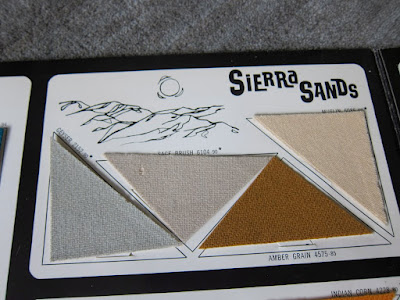
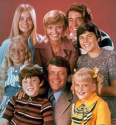 |
| The Brady Bunch looking very "Sierra Sands" with a hint of "Painted Desert." |
Then, just as now, colors were given provocative new names consistent with the fashion "story" they were meant to tell. Just as orange is now Tangerine Tango, in 1971, Milliken called its vibrant red War Paint. The Native American population was thrilled.
More Milliken color samples pics here.
So I ask you: as sewers, how much attention, if any, do you pay to color forecasts like the one from Pantone? When I saw the men's forecast for Spring 2012, I couldn't relate in the least. The descriptions of the colors themselves are so banal and the color choices....you won't find me in Starfish (aka beige), rest assured. To me this whole forecasting idea seems very played out and Twentieth Century. Do you agree?
In closing, when you hear a color is Color of the Year, does that make you run toward it or away from it -- screaming?
Anybody have additional insights into this industry they wish to share?
Have a great day, everybody!


Ehh, no, I couldn't care less about tangerine tango or how we're supposed to eat, drink and breathe it for an entire year. I'm sure it's stunning on some people, but not everyone can pull off such a bold color. As you say, this is mostly about the big bucks for the industry, and surely is an effective way to motivate the rest of us to shell out our paychecks on new garments and accessories just because of the color. I also think it works because consumers LIKE having guidance about what's on trend so we have an easier time shopping and choosing what to wear. Or, I guess, we're trained to think we like it!
ReplyDeleteI agree with you . . . I do. But then I think about how certain colors and color combinations are are so associated with certain times. Aqua and pink with the 50s. Avocado green and brown with the 70s. Neon and black in the 80s. It's very weird how there does seem to be a zeitgeist of color. And it can't be just that companies are producing it . . . it's that people are buying those colors over other colors. Right now I'm sewing a shirt with an orange, white and black print that I thought was so NOT of the moment. I was startled by the "tangerine tango" proclamation. Am I tapping into the color zeitgeist without knowing it . . . in this case, the GITMO zeitgeist? Do you remember a few years back when blue and brown was everywhere? Why is there a communal "aha" over certain colors at certain times. There's something to it . . . but it beats me. I think that I'm the type to run FROM the color of the year, but without knowing it, I've made it the color of my first sewing project of 2012.
ReplyDeleteI completely DESPISE these "color trends" and "color forecasts". I know what colors look best on me, and which ones will get me offers of a ride to the local ER. The concept of colors being trendy or in fashion for a season or year is really quite strange when you step back and think about it. My skin tones don't change with the season or calendar year.
ReplyDeleteOh, and any orange will earn me offers of a ride to the doctors or ER ...
I don't care much for color forecasting unless it involves a color I already love - then I'm excited that my options with the color will be plentiful for the year :)
ReplyDeleteAnyway, I love Painted Desert. I would wear all of those colors - together or not.
I enjoy seeing the forecasted color and how it affects retail...EVERYTHING this season where I work is a neon coral color (even jeans). Horrendous! It is like they took the Tangerine Tango and blended it with their last favorite forecasted color, Honeysuckle.
ReplyDeleteI tend to run AWAY from trendy things, unless I genuinely like it. Hearing of a "color of the year" is definitely not going to make me wear it. I think you're spot on. Companies use the tool for mass production purposes. Thanks for posting! I enjoy your blog!
ReplyDeleteI agree that a color combo is much more compelling than a single color! I do pay attention to the forecasted colors, because it's interesting! In this case, I love orange. I can't wear too much of it (who can?) but I am glad that I bought some orange shoes last year and I'm shopping around for an orange purse. Just because it's fun. :D Now, if I hated orange, I'd just shrug and move on.
ReplyDeleteI absolutely Love deep red-orange (and can actually wear it -- pumpkin, not so much...), but am relatively unfazed by any mandate from the fashion industry. They don't cater to me anyways (40+ fat gal who wears orange! ;^p), so I take that stuff with a grain of salt. AB is right; it's all about the dollar and them getting you to follow and spend your $$ on new stuff that may not be the right look for you personally, but will help you blend in with the rest of the sheeple.
ReplyDeleteThat said, I do like to see inventive color combos put together. Not that I'd wear them, but it does spark an opportunity to move out of my comfort zone.
Oh, and 'Starfish' = Beige? Lame. Anything to make Generic more exciting...
Mmmmmm....year of the pickle.....
ReplyDeleteHi,
ReplyDeleteYes, that fashion drawing DOES look like a bratz doll! Ewww.
I guess, personally, I could care less about what color is predicted to be "in". But like Erzulimojo, I find myself drawn to certain colors, only to find out it's the popular thing. How strange. (Though I don't think I'll have that problem with orange!)
However, I do like the more coral shade...
It seems to me that every time I hear about the color of the year it's something ridiculous, like tangerine, or nude, or taupe, or mustard. *lol* I've always been a big fan of the "neutrals" navy, white, red and black, and while I do like to mix it up (coral, purple and teal seem to be "colors of the season" every now and then), I certainly don't do it on demand...
ReplyDeleteThere's a color forecast? Seriously, the closest I come to paying attention to fashion is watching Project Runway and reading TLo.
ReplyDeleteIn the last couple of years I've gotten into the habit of always looking at the next season's color forecast before I start planning my sewing projects for the season. I don't look at them with any intention of letting them dictate or even guide my color choices, but every now and then one of the "it" colors or color combinations will hit me in just the right way and I'll have this "ah ha!" moment of realizing that that's the color I've been longing for the last few months. If I hadn't looked at the forecast I wouldn't have been able to articulate exactly what that color is, so the forecasts can occasionally be useful in that way.
ReplyDeleteEven when no specific color jumps out at me, I find the forecasts useful in terms of what colors are going to be everywhere, and what colors are going to wear thin real quick. Take Tangerine Tango for instance. Everyone is going to be sick to death of seeing it by April. My bet is a lot of people will start craving an antidote color, something fresh and easy to counteract the bold overworked oversaturated feeling of Tangerine Tango. Sweet Lilac, another of the Spring 2012 colors, is pretty close to that antidote color, but still a bit too dark and saturated to be enough of a breath of fresh air once Tangerine Tango Fatigue sets in. Personally I'll be leaning towards a slightly lighter, more delicate pink to counteract Tangerine Tango Fatigue. A soft ocean blue could be good, too. So knowing how much I hate Tangerine Tango and my guess that everyone will grow to hate it before summer hits, I'll use some of those antidote colors in my spring and summer sewing. Nothing set in stone, of course, but I do find the color forecast helpful in predicting what colors I'll be craving in my closet six months from now.
Very strategic! ;)
DeleteThis will actually be the first year I care about the Color of the Year. Since orange is my "signature color" (a la Steel Magnolias), I am excited about the prospect of being able to find more accessories/appliances/whatnot available in a shade that can be relatively hidden for the rest of the decade. I'm hoping there is an orange sewing machine coming out this year - I would not be able to resist.
ReplyDeleteOh, Peter. For your unfair hatred of my favorite color, you are off my Christmas card list. ;-)
ReplyDeleteNot that I care who says what color is popular, but I feel like fierce orange was last year's color. When I sewed my Lady Grey coat, it was hard to find orange coating. But by last summer orange was everywhere.
I remember when everyone "had" to have Farrahs hair,avacado or rust or yellow appliances. How I envy the freedom that todays society enjoys in personal and decorating style. So no,I don't care what someone who will never meet me thinks is the "in" color this or any other year.Great blog Peter!
ReplyDeleteThis reminds me of something the Selfish Seamstress complained about a while back... According to a lot of those seasonal color analysis formulas, all people with black hair are lumped together as "winters". Not just silly, but a tad racist.
ReplyDeleteThe only thing I find interesting about these colors of the year is that in the distant future, archaeologists will be able to use them to date refrigerators and handbags and other materials traces of our loony existence.
I pay attention when the colour of the year is something I can wear, like orange or turquoise. That's when I stock up on fabric. Otherwise, around here it's a sea of pink, grey, purple and jewel tones, all of which make me look sick. Being an autumn means you're in the minority in North America, so there's usually not a good selection of suitable colours all the time. I sometimes envy those who can wear grey and purple.
ReplyDeleteOne of the many reasons I started sewing was so I could pick my own colours. Sometimes this aligns with the 'it' colours, it just depends. But before sewing, I had several seasons where I didn't buy any new clothing because the in-colours were horrid! I'm talking specifically about the 'camel' (a ruddy beige) phase a few years ago. Way to make the population look washed out! I also have a pet peeve of how at the slightest onset of winter, everything in the shops is suddenly black. Then spring hits, and it's like colour is some new invention never seen before! hehe. I'm always curious to see the patone release, but I don't dictate my sewing my it. I doubt I'll be sewing anything orange any time soon!
ReplyDeleteMy husband went to one of those color marketing group conferences. He designs flooring so he was in on a discussion about the colors in home goods. I think it's more applicable for home decor because items across the board will "go together." But other than that, I dunno. He said some of the talk was pretty ridiculous. I am a color nerd, though, so I enjoy talking about and looking at color all the time.
ReplyDeleteI enjoy fresh new color combinations, so I look forward to the forecasts. But I certainly don't want to be limited to a small slice, like you are when you have to buy RTW. And I don't like how it makes my home feel already behind the times, when it shouldn't. Something that strikes me, though, as the color of the year hasn't seemed that ahead of the game recently. I remember orange having a huge moment sometime around 2006. I saw it everywhere. But only now is it color of the year. And when they announced turqoise a year or two ago, I was so surprised as everyone had been loving and using turqoise and aqua for SEVERAL years before.
ReplyDeleteI would actually want to make a pair of tangerine tango clover pants. It is something different.
ReplyDeleteI thought those forecast were pretty much what is seen on the runway, which will end up in stores. But nothing your common (wo)man would really pay attention to.
I don't normally care about color forecast, but this year I am interested in doing my wardrobe palette in those colors (maybe not all). I need to add some color to my wardrobe anyways.
I think I'm having a flashback to "The Devil Wears Prada". :)
ReplyDeleteIn one sense, I don't care one bit what they put in the forecast. Yet, I would guess that a month or so into the season, the colors will start seeming right. (Except for Tangerine Tango. Yech!)
I enjoy the color forecasts, but I just enjoy anything to do with color period. I don't treat them like a fashion dictate. I was just happy with Hydrangea, 2011's color because that is one of my favorite colors. I'm okay with the orange and I happen to have a lovely quality orange DKNY sateen I procured from an online shopping binge, so perhaps I should make it up into something.
ReplyDeleteTHAT'S why all the appliances were those colors?!? This is a really fantastic trivia tidbit, if nothing else.
ReplyDeleteI am completely in love with red-orange, but unless Panetone picks that one and I can start getting more clothes in *that*, I'm uninterested. I mean, one color? What does that even mean? Surgical appliance pink is fine for a sunrise, but would look awful if, say, the people who make toilets got into it. This concept is puzzling. Congratulations on sending me into an internet search frenzy on the origins of this concept :)
~ * ♥ * ~
ReplyDeleteUgh. Shoot me now. I really, really despise the color orange and most, if not all, variants of such. Will I be listening to this 'color forecast'? Er, nope, nadda, no way, etc. However, it is interesting to see how these things effect main street and all the products that are produced. Thanks for sharing Peter!
xox,
bonita of Depict This!
~ * ♥ * ~
The concept of "this season's color" means that last season't color is "out" which means that if the industry had its way, next year's garbage dumps and landfills will be full of tangerine tango. This has been going on for much too long! We are ruining our environment with mega quantities of poisonous plant spray to grow mega tons of cotton which are dyed with mega gallons of chemicals to become short-lived fashions in this season's color which next season will become mega tons of waste.
ReplyDeleteI sew so that I can contribute as little as possible to this madness. I want to invest my time, money and energy in a style and color which will look good for more than one season, that I can wear next year (or next decade), and which will help me get through those years whose "in" color is definitely not me.
I dislike colors "not found in nature", like HIGHWAY CONE ORANGE, my name for Tangerine Tango. I find the shades garish, disturbing even - certainly nothing I want in a room on a cushion, let alone covering a sofa (or in a dress.) Reminds me of Attention Deficit Disorder, that is, people who want attention from strangers often wear ghastly neon colors. I couldn't hope to feel elegant or pretty in a harsh color like that. Makes my stomach tighten up just to look at burnt orange.
ReplyDeleteI pay lots of attention if it's colors I'd wear anyway. Of course, I completely ignore the color forecasts when they call for pastels. Yuck!
ReplyDeleteI think it matters little whether we like or dislike the colour of the year, the act of publishing the all important list of colours governs what will be available a few years hence in appliance colours, fabrics, clothing, furniture, right down to plastic bins at the dollar store. It's like my Dad used to say about his Model T Ford, you could have it in any colour you want, as long as it was black. Unless you sew, clothing choices are somewhat limited to the colours that are being produced. So as much as the consumer product industries listen to the colour predictions, governs how much we have to accept by default the colour choices that someone else has made (and named - can you imagine if the most important part of your job was coming up with a new name for orange, or beige? - I'd rather wrestle sharks thank you LOL)
ReplyDeleteSo personally, I drive my own bus as far as fabrics go. If you can't find a colour in the stores, I probably have some in my stash anyway so it doesn't matter what's available. (I am so not kidding about the stash!)
I run the other way from the "color of the year" unless I happen to like the color...I would never wear a color I don't like just because someone decided it was "the color" this year - bah!
ReplyDeleteI agree completely, Peter, that's one of the reasons I like to sew for myself. And now that you can purchase fabulous fabric online, I can get just about any color in any type of fabric I choose, woo-hoo!
Some look great in orange, so this is obviously their year coming up. I look like I have liver disease in orange, so I won't be changing any of my wardrobe choices.
ReplyDeleteI did see some really cute appliances in a Crate and Barrel ad that were all sunny yellow! What will they all look like when covered with kitchen schmutz!
I only pay attention to color forecasting if I'm working with a client who buys into that. Otherwise, no. I feel it only serves to feed us too much of a color so that we get so nauseatingly sick of it by March & never wants to see it again. This is going to kill orange for a long time to come. It kind of ticks me off too that I used a lovely shade of tangerine quite liberally last year when I redecorated my studio, now it makes me feel like a hack.
ReplyDeleteI'm hit predicting it is going to be a Sunshiney Yellow next year.
ReplyDeleteAnd I was thinking about "The Devil Wears Prada" too.
ReplyDeleteFor my personal wardrobe I don't care a bit unless some of my favorite colors are in and I'll more easily find fabrics with those combinations. As a homeowner contemplating selling a home in a year or two I know that consumers' eyes get trained by the color trends. I have to be willing to look at my home furnishing and see how a color change can update my look or else risk people seeing "dated" and not desirable.
ReplyDeleteI'd steer clear of avocado and harvest gold! ;)
DeleteOrange of any shade (even under the alias of "Tangerine Tango") would have to be my least favourite colour.
ReplyDeleteWhich is good - one of the pitfalls of having one's favourite colour being in fashion is that in a year or so it screams "out of date", whereas if it hadn't been the colour of the year, everyone would be left guessing.
I've experienced another problem of colours coming in and out of fashion. A few years ago I was given a length of beautiful linen in a stunning aqua colour - a shade I hadn't seen for years (the fabric came from someone else's stash, and was quite old). My preferred pattern for it included a bit of topstitching, lining and a zip. Regrettably, none of the thread at my local haberdashery came within cooee of a satisfactory match. The saleslady, reasonably canny, commented "I haven't seen this shade for a while - would this fabric date from the 70's?" I conceded this, and she explained to me the intricacies of colour forecasting, and the implications it has on a whole range of other products, including thread. If a particular shade is in fashion, then thread will be easy to find. Once out of date, thread and other colour matched notions become more difficult.
I revised my pattern selection, lined the garment with cream, omitted zipps and topstitching. I got (and still get) favourable comments whenever I wear it, on the unusual colour.
I took some classes at FIT and I remember a professor telling me about one lady who was a (the?) pre-eminent color forecaster. She would hold an event that everyone would clamor to get into... then she would say something like "tangerine tango" and then the audience would go and use that color on everything. Too bad I don't remember her name; what I took out of the story was that there are people who essentially have enough clout to decide what color we will be seeing nonstop!
ReplyDeleteNo insights here. I can just say there is no way you'll catch me either wearing orange or living in orange surroundings. *shudder* :-)
ReplyDeleteHmmmm. Take a look at Peters shirt at the heading of this blog. I am a little puzzled about all of this negativity over a nice tropical color. It IS found in nature, as one responder seems to be unaware of. It's a great thing that we all have our favorite colors, and I will enjoy seeing creative uses of one of my favorite colors. It does take a little sensitivity to use it to it's best advantage. Hopefully we can widen our scope and enjoy some change.... or, just stay with the beige and black if that seems safer. Happy sewing.
ReplyDeleteI have to agree with Frank Sinatra on this one, "orange is the happiest colour". Bring it on!
ReplyDeleteWhen I was at art school (studying photography, not fashion by the way) we once had a presentation from a lady who worked in colour forecasting. She worked for the fabric industry, which meant she had to predict trend colours two years ahead of time, usually a year before those Pantone colour things become public. And indeed, as I understand it, it's all about the fashion and design industries' hunt for the next big thing. They obviously don't want to be caught using last years' fabric for next years' trend looks... which is where forecasting comes in.
ReplyDeleteBesides the obviously money-spinning nature of the business, this lady mentioned something else too: how colour forecasting is done by just a handfull of agencies worldwide and how, despite publishing at the same time, they usually tend to agree in their forecasts. Like all trendwatchers, she claimed some sort of sensitivity to the Zeitgeist and how that would express itself in colour...
And the strangest thing is this: there seems to be at least a tiny something to it. And as a seamstress you can get attuned to it. I buy most of my fabric at the market (so not from new trend collections) and I don't read a lot fashion magazines but for the past few years I've often found out that the very colour I had been looking for for months was now, according to the forecasters, the new trend colour (musterd yellow, turquoise...). And indeed: I've had some orange in my stash for a few months and just picked up a zipper yesterday to make a skirt from it...
I didn't know about companies making colour forecasts! I'm with lladybird, if it's something I like, I hope this means there will be plenty in the shops.
ReplyDeleteAnd I really like red-orange, just not to wear :-D
I hate color trending. There have been whole years where it was nearly impossible to find something to wear that didn't look horrible against my skin. I say, stop trending and let the colors run free!!!
ReplyDeleteI can't say that color trending has any affect on me and my sewing. (I mean, yes, yes, I am aware of the Devil Wears Prada cerulean rant, but aside from that...) Typically when it comes to fabric choices I buy what I like and I care little if it has nothing to do with anything trendy. Besides, I am sure that by the time I get around to actually sewing up some of my fabric it will be very much not on trend, and that is ok with me! I stick to colors I like and don't really care what anyone else is doing.
ReplyDeleteAnd, as for Tangerine Tango, it isn't the most awful color, but it certainly won't look good on me! So you won't catch it making an appearance in my sewing any time soon.
Here (Europe), Pantone is not very known but we still have "Colors of the season" (and it was orange last summer, strangely - this year it's pastels or "mermaid colors"). I like to buy a couple of inexpensive accessories in these colors when they work with my wardrobe colors (in summer it's mostly black, white and tan, so it can work with a lot of summer-y accent colors. In winter it's mostly black, grey and blue so a bit more difficult to match - I made a mistake to buy a small burgundy bag and ended never using it). I do not sew or buy big items in those colors because their lifespan is so limited - I'd hate to invest time or money is a piece that will be dated next year.
ReplyDeleteNo point in asking me about colour at all. As a young thing teaching fashion students in a city environment (NOT teaching them fashion) I decided that the women with whom I really identified were the black clad nonnas poking at the tomatoes and bargaining ferociously with the stall holders in the market. They just looked happy and they didn’t need to diet. So I’ve been the fat little lady (now the fat little old lady) in black with a splash of bright pink or purple for the last gazillion years. I keep on saying it's time for a change and I keep on not making one. Black is the colour of the lifetime!
ReplyDeleteOne of the reasons why I want to learn how to sew clothing well is to get away from this type of thing. I want what I want, when I want it.
ReplyDeleteThought I meant to add, I do like that orange - such a 'happy' bright color...
ReplyDeleteColor of the year implies what the factories will produce for the masses. The half life of brilliant colors tends to be the inverse of the number of washing cycles for the season. For a while everyone will look like the coral of the great barrier reef. When the tides recedes, folks wIll all have a milky brown look.
ReplyDeleteThe Pantone thing doesn't bother me, as it simply shows a focus of what will be available commercially, and sometimes I take the trends and play with them just to be fashion-forward. But for me, color comes down to two things: do I like it, and does it look good on me? That's one of the reasons I like to sew, as there's a greater chance I can find some sort of fabric in a color I love, and work with it from there.
ReplyDeleteI am however Delighted to find you've announced the Year of the Pickle, as I have my first-ever batch of refrigerator dills percolating even as we speak. Talk about fashion-forward...I shall scoop my entire neighborhood!
Year of the pickle. You'd better get yourself a good one if it needs to last that long....
ReplyDeletehttp://gothamist.com/attachments/nyc_arts_john/012611pickle.jpg
"Is there a food of the year we eat to the exclusion of others?" Oh no I think you spoke too soon. I have literally just had a press release drop in my inbox on 'the flavour forecast', forecasting food trends (groan!).
ReplyDeleteI am really happy when one of my colors shows up on the semi-year forecast because then I know it won't be so hard to find something to wear that is flattering.
ReplyDeleteIs that why we sew? to bridge the gap between when your color is in and now it's out?
I like orange. A variation on Tangerine Tango was the color of the year just a few years ago. I think this is useful information for people who pick out colors for appliances etc, and have to explain to their out-of-touch boss why they picked that color: "Well, sir, it's the color of the year as forecasted by blah blah blah". As I don't sell anything, or make anything that is sold/bought (etc John Cusack á la whatever that 80s movie was), color forecasting doesn't even really interest me.
ReplyDeleteTLDR: orange=good, color forecasting=who cares
Let's face it: color forecasts make people buy new clothes. Fashion is also synonym of information and that is a way people show they are well informed and updated. Everyone with a bit sense and taste should see if the color fit to oneself. In my oppinion just warm tanned skin color a la Eva Mendes, or who has white-rosy color skin tone can wear orange/tangerine tango. The others will look like they are sick or like in a Carnival costume.
DeleteI want to go live with Rose in Europe! One of my fashion goals for this year is to embrace pastels. I want to dress a little bit Mori Girl meets classy 30s/40s androgyny. I've been practicing combining soft colours with more rich/bold ones, like seafoam and burgundy just the other day.
ReplyDeleteThis spring's colour palette is generally terrible. There's nothing to offset the OMG MY EYES brights aside from two muddy browns. If Sweet Lilac, Margarita and Cockatoo were all lighter, this would have been a very workable palette.
Wow...59 comments and counting...only need to add a couple. A...the reason it is Tangerine Orange is because This Blogger Orange is all over the internet and it took hold. This really only has to do with the color of plastic storage you will see on Target and Walmart shelves. It will hit hard in that product line but like others said before...Look at July 2011 Glamor, this color was all over their pages. For me I just like to read all your comments on this fabulous blog once again...great topic Peter.
ReplyDeletePerhaps by the end of the year, we'll all be prisoners, thus the color reminiscent of Guantanomo.
ReplyDeleteAaaaaaaw comeon...have some fun with this....I think they picked "Tangerine" because of all the stuff on the runway, which professionals say it's because orange is a happy color and bright for spring, yada, yada, yada. OK - I admit, I love orange (it looks great on me), and last year it was Honeysuckle Pink - yuck!!!! Puhlease...it's all part of reliving the 70's...just think - it's only for a year! Next year it might be grasshopper chartreuse!;-)
ReplyDeleteI love orange. I don't know for sure that it loves me, but I wear it quite a bit - just not in 70s colour combos! I'm sure that what gets stocked in fabric shops each year relates to the colour forecasts, but if you build up a fabric stash (or use vintage fabric) you can ignore the annual colours and don't have to worry about being 'on trend'.
ReplyDeleteI love color and I notice it, often naming it specifically as pine green or forrest green, magenta or fuschia, etc., probably due to occasionally working with colored pencils on botanical drawings. I also wear bright colors sometimes if they are flattering to me.
ReplyDeleteThe purpose of the above was to explain that earlier today I had seen two fashion displays (if that is the term) which I thought were most attractive. The first was a ruffled top of bright orange (Tangerine Tango) worn with intensive pink pants (Cabaret) , a simple purple ribbon worn at the waist (Bellflower) to tie the out fit together, and I paraphrase the author. Actually, very attractive on the model who was tall and thin and had dark red hair and very fair skin.
The second picture was of the same girl with a top of bright blue green, possibly a turquoise (Hawaiian Ocean) , with a skirt of deep intense blue (Dazzling Blue). Very nice indeed and a color mix I might wear myself.
The title of the article ( well, series of fashion pictures) was YOUR BRIGHT FUTURE and, I assume, was to show the public how these colors could be combined.
I will say I do like these colors a bit more than, say, Honeysuckle last year. I'll be looking for those orange toilets!
LindaC
I tend to wear a colour until I wear it out and then switch to another for a lot of my clothes. I remember refusing to wear navy blue for a long time after I finished high school (it was my school uniform colour) - and I think red was the colour of choice for me back then. These days I wear a heck of a lot of what I call "Cadbury" purple, after the chocolate wrappers. It's not a plum, but much closer to a blue purple. (In fact, a car salesman tried to convince me that a blue car I was inspecting was purple. NOT.)
ReplyDeleteThe other day I was supporting my daughter at a dance competition and was wearing a purple maxi dress with purple sandals and of course carrying my purple purse and mobile phone. One of the little girls in the team asked me if I liked purple at all. I tried to convince her that I hated the colour "like totes".
Looking through my summer wardrobe though, I seem to have a lot of pink dresses, so maybe that's the way I'll go after purple. Can't imagine changing the streak in my hair to pink though!